How to make responsive website
January 17, 2017

A responsive website changes the dimensions and capacities of all devices or browsers on which it is viewed, ensuring that visitors may always view the best version of your site. Today, the development of a receptive website is vital for generating a successful user experience with so many devices, browsers and resolutions on the market. Web app development company in India putting their extensive efforts to make a responsive website. This is the perfect answer for how to make a responsive website.
If you’re a designer or a website creator prepared to initiate a new responsive project, your thinking on relative dimensions and proportions will likely need to be adjusted rather than a fixed and final design. Read about expert advice for making a responsive website from beginning to end and build a responsive website from scratch.
Read More : How much does it cost to hire WordPress developers in India?
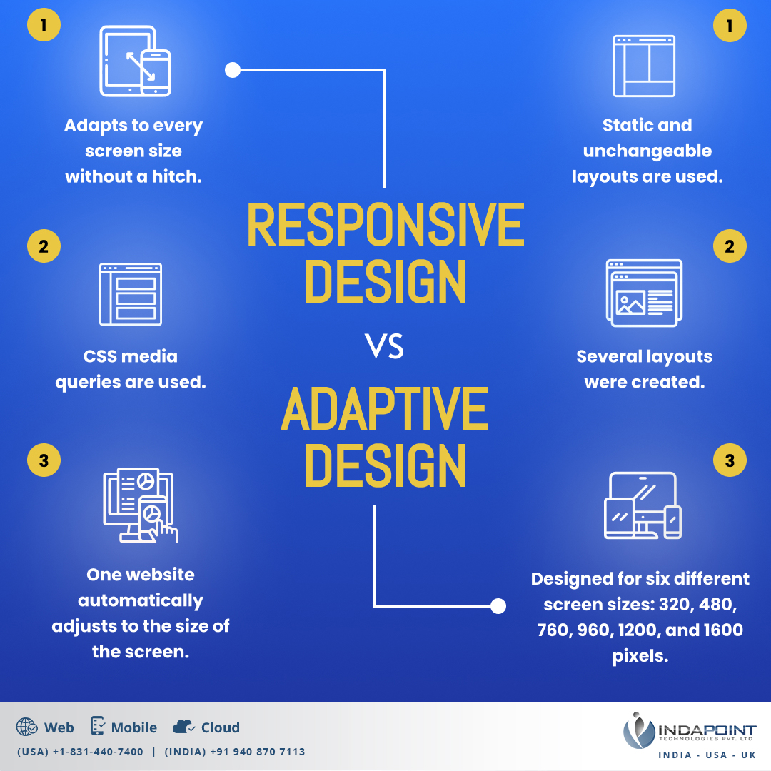
How is a responsive website different from an adaptive website?
The difference between responsive and adaptive web design is likely complex. Some important distinctions are highlighted below and make a website responsive and fully responsive:
Responsive vs Adaptive Design
Why is it so important to have a responsive website?
Many businesses spend a huge amount of money each year on Google or other search engines to improve website traffic, which in turn leads to greater sales and revenue. In today’s global economy, you can communicate with people in more nations than you probably ever imagined, and they use a variety of devices, including tablets, smartphones, laptops, and desktops which are important to create a responsive website.
The fact that you and your team spend a great deal on a professional website, will not help drive your business more effectively than your previous website, and if you consider that the majority of users use mobile devices, the benefits of responsive website code are evident. Creating a responsive website is important. It is not only very affordable to have a mobile site, but both your website users and Google will be able to reward you. In 2016, Google informed website owners that it will reduce visibility for non-mobile websites since users using these websites had poor viewing experiences on how to create a responsive website. Based on the second search engine results page, fewer than 30 per cent of all Internet users now give priority to responsive web design to have a significant internet presence with a quick responsive response. In this regard, WordPress development company in India offer services regarding this.
Read About : How to revamp HTML website to WordPress – manually or automated?
The importance of a responsive website for successful results:
If you want to acquire a competitive edge now and sustain it tomorrow, you need to build a responsive website, whether you’re a startup or enterprise. Every business owner must know how to create responsive website.
- Smartphones will account for 70% of B2B search queries.
- Smartphones and tablets now account for more than 57 per cent of all online traffic in the United States.
- Users believe they are more likely to buy from companies that have mobile sites that answer their queries or concerns quickly.
- Users said they won’t suggest a company that has a poorly designed mobile site
Read About : 5 Reasons to Build a Custom CMS for your business
How to make responsive website
Creating a responsive website is incredibly crucial nowadays. It is one of the techniques that our web developer or designer learned and practically applied in the website development process of developing a responsive website and focussed on making the website responsive. In this article, we will take to the tour the significant function of making the website responsive.
1. Start wireframes
The method of developing a responsive website always starts with layout planning, and the early layout tool is no better than cable frames. A wireframe represents a scheme for a future design and is a convenient way to structure your layout in an organized. This is the initial stage of how to create responsive website.
2 .Set your breakpoints
Breakpoints are the foundation of responsive design, making them an essential stage in developing a responsive website. A breakpoint is the “point” at which a website’s content and design change in a certain way to deliver the greatest possible user experience in the responsive website, which requires efforts to create a responsive website and build responsive websites. Breakpoints are pixel values at which your design is altered, so visitors always see the best version of your site, no matter what viewport size they’re using. The software must render flawlessly on all screen sizes. It is not possible to alter or obscure content or images in the process of how to create a responsive website.
It is crucial to rent a coder in the process of how to create a responsive website.
3 .First design for the small screen
Most designers use a mobile-first strategy when building responsive layouts, which means they design the content to fit a tiny screen size first. Create a layout that works effectively at the smallest breakpoint and then expand it to accommodate wider viewports and make website mobile responsive. This is crucial in the process of how to create responsive website. Each website is viewed on a variety of devices with varying screen sizes and resolutions on how to make website responsive.
4. Build a fluid grid
A grid is a two-dimensional structure with columns and rows that allows you to precisely position UI elements on a page. Individual UI elements will overlap in different screen sizes if you don’t employ a grid properly, resulting in a solid, responsive layout.
Grid gives you the freedom to create a custom layout for each of your breakpoints, ensuring that your content and design precisely suit each viewport. A better layout for site visitors can be achieved by adjusting the number of columns and rows in a grid and their size and spacing. Rather than designing objects in single, fixed pixel size, items on a fluid grid will adapt and resize to match the screen to create a responsive website.
5. Optimize design images and videos
The perception of a design is heavily influenced by image quality. A website with sharp, appropriately sized images is more likely to generate a favorable impression on visitors. This also clarifies how to make a web responsive.
The issue with images is that they aren’t naturally fluid, but you can still change their resolution. It’s critical to maintain your images’ highest quality and accurate aspect ratio across all screen sizes. This helps in how to make a website responsive.
Check out the coding below or you can rent a coder.

<style>

img {

max-width: 100%;

}

</style>

<picture>

<source type="image/webp" srcset="https://my-image.com/my-image-100.webp 1x, https://my-image.com/my-image-200.webp 2x">

<source type="image/png" srcset="https://my-image.com/my-image-100.png 1x, https://my-image.com/my-image-200.png 2x">

<img alt="my image" src="https://my-image.com/my-image-200.png" loading="lazy" width="100" height="100">

</picture>
The use of aspect ratio in videos is an excellent approach to improve responsiveness. It is advisable to rent a coder for this process.This is explained in the code below:
<style>

.videoWrapper {

position: relative;

padding-bottom: 56.25%; /* 16:9 */

height: 0;

}

.videoWrapper iframe {

position: absolute;

top: 0;

left: 0;

width: 100%;

height: 100%;

}

</style>

<div class="videoWrapper">

<!-- Copy & Pasted from YouTube -->

<iframe width="560" height="349" src="http://www.youtube.com/embed/n_dZNLr2cME?rel=0&hd=1" frameborder="0" allowfullscreen></iframe>

</div>
Read About : What could be the costs to develop a multi-vendor eCommerce website?
6. Optimize the design response typography
Images and text are two web experience-building elements. Good reading and readability are key characteristics of a good user experience. This is important for creating a responsive website and building responsive websites.
It works in the same way as the em unit, but it is applied to the responsive html code. Therefore, the code html responsive font size needs to be reset to:
html { font-size:100%; }

The font widths that will be responsive now:

@media (min-width: 640px) { body {font-size:1rem;} }

@media (min-width:960px) { body {font-size:1.2rem;} }

@media (min-width:1100px) { body {font-size:1.5rem;} }
In the end, it is essential to test the device before launching. The need for testing on real devices is often underestimated while researching how to make a responsive website. The code can be tweaked as much as the developers wish, but its functioning must be tested in real-world scenarios. Run the site through a responsive design checker once it’s been coded. A Web app development company in India can provide you with various most up-to-date real-world devices to test how a website looks fully responsive.
Conclusion:
Responsive web design will keep evolving rapidly, but if we stay on top of recent trends, you can offer the most excellent possible experience to the user. An adaptable design will assist our website users and help search engines rank our sites higher.
Several different components are found in responsive web design. It can be easy to make mistakes without a basic understanding of HTML and css layout responsiveness. It is important to build a responsive website with html5 css3.
 But you should be able to make your website more responsive without any major problems through familiarizing yourself with the various building blocks, analyzing examples with Web Dev tools and testing your sample code.
If that seems like too much work, you can always hire a WordPress developer or simply make sure your theme is responsive.
Indapoint can assist you with making your website responsive if you need some professional support. With over 1000 sites launched, we provide responsive web design and development services.


