The top compelling data visualization javascript libraries to look at in 2021-22
December 16, 2021
Data visualisation is a science as well as an art form. If you work with data, one of the most difficult challenges you may face is determining the best way to shape and present your data in a readable format. A proper visualisation flawlessly conveys the meaning of the data analysis performed.
Because there are so many different types of data visualisation tools on the market, it’s no surprise that it can take a long time to find the right one.
To free up your time for more complex tasks, we are going to present you with the list of the best JavaScript libraries for working with data.
The best JavaScript data visualisation libraries in 2021 -22. We humans have been exposed to unprecedented amounts of data in the cloud computing era, which also brings the opportunity to improve processes and approaches by analysing past data. To analyse that much data, we need to represent it graphically, filter the meaningful data, and establish relationships with data visualisation and business intelligence tools.
What is data visualization?
Data visualisation, in its most basic form, refers to how we represent our data with visuals such as charts, graphs, and so on. It is the graphical representation of data, usually a mapping or relationship between data points and lines on a chart or graph. In general, it entails creating the best visual interface for our data.
The shape of the visualisation is usually determined by the relationship between the graphical elements or types chosen and the data points involved. The ultimate goal is to clearly and effectively communicate information derived from data sources through visual or graphical means.
Data visualisation, as it is sometimes referred to, is especially useful for helping us tell stories about our data while also understanding the representation of a large set of data points at a glance. Primarily, the major goals of data are to represent data in an aesthetically pleasing and easily consumable manner.
When dealing with very large and complex datasets, the functionality of the data visualisation library in use is also critical for effective insights. In this tutorial by IndiPoint, we’ll look at some of JavaScript’s data visualisation libraries and see how they stack up.
Analyzing Best JavaScript Data Graph Visualization Libraries 2021
Almost every application we build these days requires or leverages data to improve the functionality provided to users. Today, there are numerous JavaScript libraries for data visualisation available. As a result, finding the right one is critical to easing our development process.
In this post, we’ll look at some popular JavaScript data visualisation libraries:
1. D3.js
2. Recharts
3. Victory
4. React-vis
5. V Charts
6. Trading Vue.js
7. Chartkick
8. Flexmonster
9. Webdatarocks
10. ApexCharts
11. Chart.js
12. Echarts
13. Frappe Charts
14. Nivo
15. Google Charts
16. amCharts
17. CanvasJS
18. Highcharts
19. Zoomcharts
We’ll compare their advantages and disadvantages, key features and functionalities, philosophy, and so on. At the end of the day, the purpose is to understand why we might choose one of these visualisation libraries based on their available features and our specific use case.
Let’s take a look at each of these libraries in turn:
D3 js
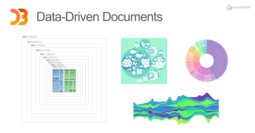
D3 js, which stands for data-driven documents, is a javascript package that allows you to create interactive dynamic data visualisations in your browser. D3 js manipulates Document Object Model (DOM) nodes in a similar way to jQuery, therefore it has a shorter learning curve for individuals who are already familiar with HTML, CSS, and jQuery. JSON, geo JSON, and CSV are the accepted input data formats for D3 js, although custom JavaScript can be created to add support for other forms.
The comprehensive API reference, which offers many chart types, is one of the advantages of working with D3.js. These are essentially a group of modules that are designed to function together. It’s worth noting that we can utilise these modules separately or as part of the default builds. It also includes several community-supported plugins.
D3 is also capable of animations, data analysis, hierarchical data, and interaction, D3 is known for its animation and interaction capabilities. Take a look at this simple animated treemap as an example.
D3.js, which is now at version 4, also comes with a wealth of community-developed resources, such as tutorials, videos, classes, and books. To aid learning and productivity, the D3 team has also published hundreds of forkable examples and tutorials. We can use either npm or Yarn to install it.
D3 offers over 30 modules and 1,000 methods! This is where Observable enters the picture.
It allows us to edit cells and run them automatically for instant feedback, making it the easiest method to get started with D3. With practically no coding, we can also add interaction or animation. Observable is an excellent environment for learning D3 since it simplifies code by allowing data to flow through it, similar to a spreadsheet.
Recharts
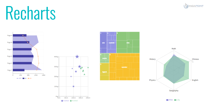
Recharts is a React and D3-based chart toolkit that has been reimagined. It’s a reusable, decoupled charting library that allows us to quickly design charts with separated React components. Its components are created on top of SVG elements with a light dependent on D3 submodules, which is one of its key advantages.
By modifying component props and passing in custom components, Recharts enables extremely sophisticated chart customisation. Recharts can be readily integrated into our React applications in general. To get started with Recharts, we can either use npm to install it or build it from the source.
Recharts also allows users to add strong interactivity to their chart components in a variety of ways. We can easily add a tooltip component with advanced hovering behaviour, for example. With support for different chart kinds, components, and shapes, it has a clean and simple-to-use API. In the documentation, there are some examples.
Victory
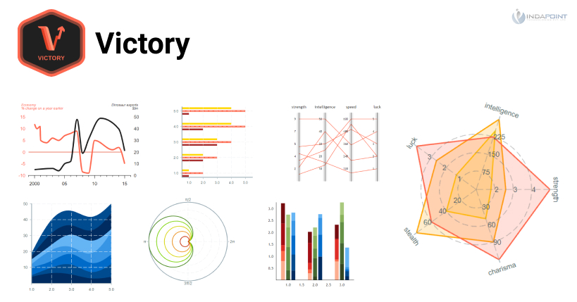
A suite of modular charting components built with React and React Native in mind.
Victory does an excellent job of laying out the foundations for creating a chart.
Customizing axes, labels, and passing in several data sets for a single graph are all rather simple, and adjusting styles and behaviour is simple and intuitive. It’s very effective, and it allows you to create some nice-looking charts with very little code. It’s definitely worth a look if you’re looking for cross-platform software.
React- vis
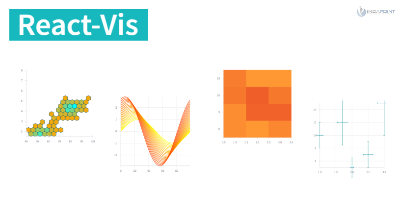
Uber designed a basic Javascript graph visualisation toolkit that allows you to generate all of the standard chart kinds, including bar charts, tree maps, line, area, and more. It has a basic API that provides a lot of versatility. It’s light and airy, with simple but smooth motions. You can also create bespoke charts using pre-existing elements.
Its simple aesthetic, on the other hand, may not be to everyone’s taste (though I enjoy it!). Although there aren’t many resources on react-vis, the documentation is simple and easy to understand.
V Charts
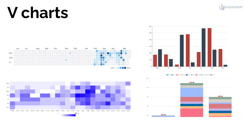
It’s a decent all-around tool for making basic charts with straightforward data configuration. It’s built with Vue2.x and echarts.
Trading Vuejs
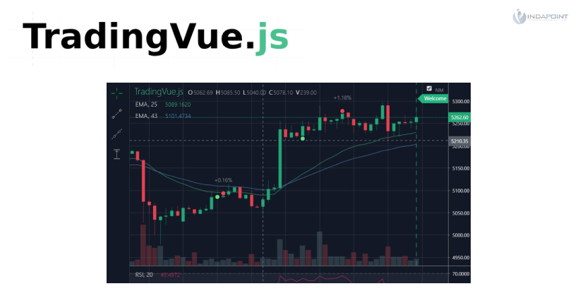
It’s a robust, all-encompassing graphing system for traders.
Chartkick
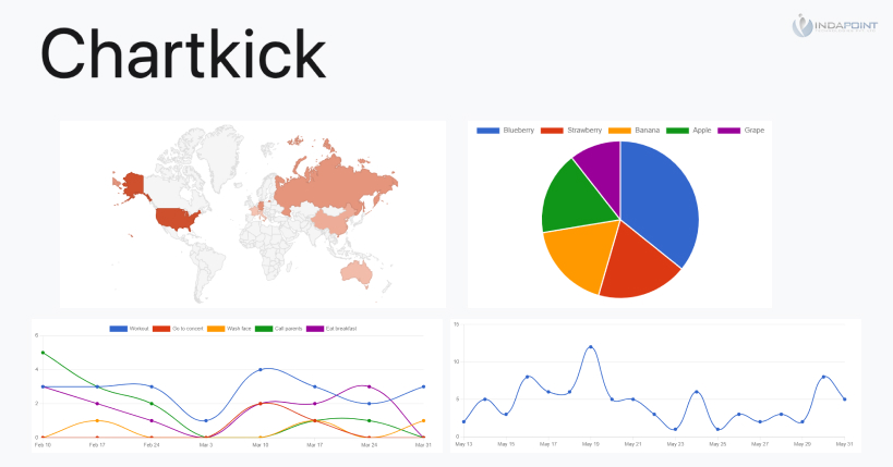
Chartkick is a great resource that isn’t just for Vue. It allows you to create charts that are both functional and appealing.
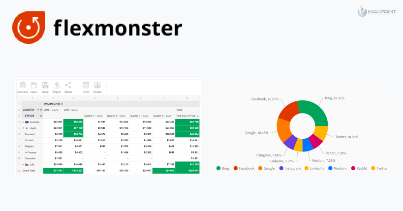
Flexmonster
It’s a React Native pivot table element. Excellent for displaying commercial statistics.
Webdatarocks
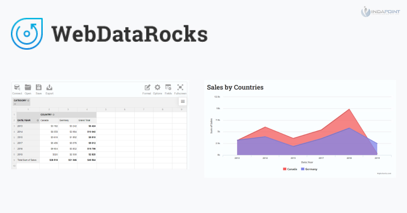
A pivot table component for JavaScript that works nicely with React and other frameworks. With its aggregating, sorting, and filtering capabilities, it’s ideal for data reporting. It’s completely free to use in your browser.
Apexcharts
A Vue.js and React wrapper is included with this useful toolkit for SVG charts. Its charts appear fantastic on a variety of devices, and the library is easy to customise and comes with thorough documentation. With larger datasets, it can be sluggish, so make sure it’s exactly what you’re searching for.
The library is still in its early stages, so there’s plenty of opportunity for improvement, but if responsiveness and interaction are essential to you, it’s a nice-looking library worth checking out!
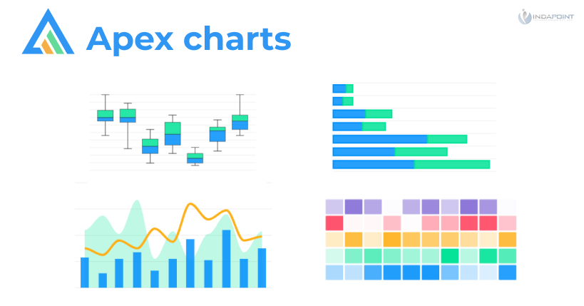
Chart.js
Chart.js is a simple to use and highly flexible framework. It’s also free and open-source, with substantial documentation and more than eight chart types, including built-in chart types, maintained by open-source developers.
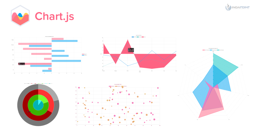
Developer capabilities enable Chart.js to be extended, customised, and enhanced in a variety of ways. The configuration is used to alter the behaviour of the chart. There are properties for controlling the styling, typefaces, and legend, among other things. As a side note, we can configure both the global and dataset settings.
Chart. js are rendered on canvas elements, they are very quick to render. As a result, it works with the majority of modern browsers, as the canvas element is supported by all major mobile browsers. It also works well with well-known JS libraries.
Here’s an example of how to use the canvas component to display a chart:
<canvas id="myChart" width="400" height="400"></canvas>
ES6 modules, simple JavaScript, and module loaders can all be utilised with Chart.js. We can use standard script tags for vanilla JavaScript. Different module loaders, such as webpack, CommonJS, and others, can also be used. We can use npm, Bower, CDN, or build the library from the source to install it.
The responsiveness of Chart.js can be modified using a few settings provided by the library to manage the resizing behaviour. This is commonly accomplished by detecting when the canvas display size changes and adjusting the render size correspondingly — even though canvas render size has certain known limitations that can lead to erroneous rendering.
Many chart extensions, plugins, and adapters are also supported by Chart.js. The most expedient way to tweak or change a chart’s default behaviour is to use plugins. They were first introduced in version 2.1.0 (just for global plugins) and were later expanded in version 2.5.0.
Consider this suggestion for large datasets or performance-sensitive applications: if your charts have significant render times, it’s a good idea to turn off animations. As a result, instead of being rendered numerous times during each update, the chart just needs to be rendered once. This will result in a reduction in CPU consumption and an overall improvement in page performance.
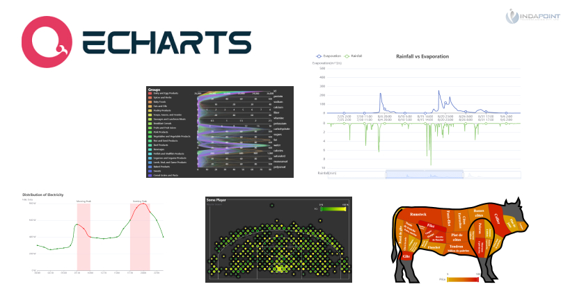
Echarts
JavaScript data visualisation library is extremely beneficial for web-based JavaScript data visualisations. It has a lot of documentation in English and works well with large datasets. SVG and Canvas rendering are also supported.
Frappe Charts
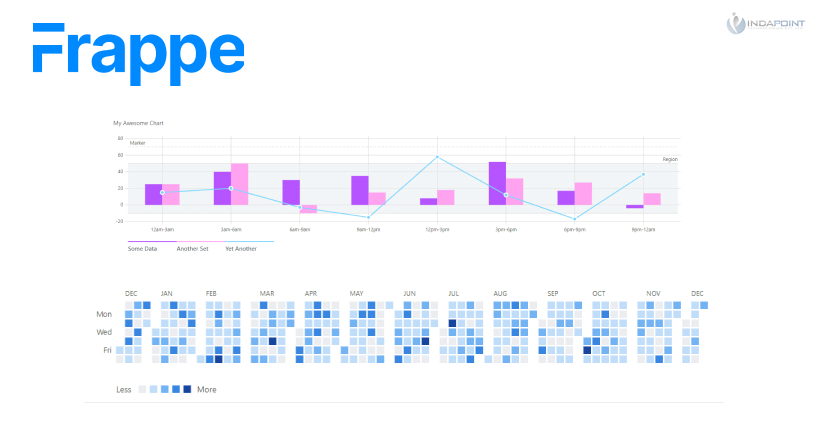
With no dependencies, this is an extremely simple library for charts. It’s open-source, and it’s one of the smallest libraries on the list, with only seventeen contributors.
Frappe Charts is a package that supports line, bar, and other forms of charts and is inspired by GitHub-like visualisations. It can also be used to create monthly heatmaps similar to those found on GitHub Activity. This is the package for you if you want something simple and light.
Nivo
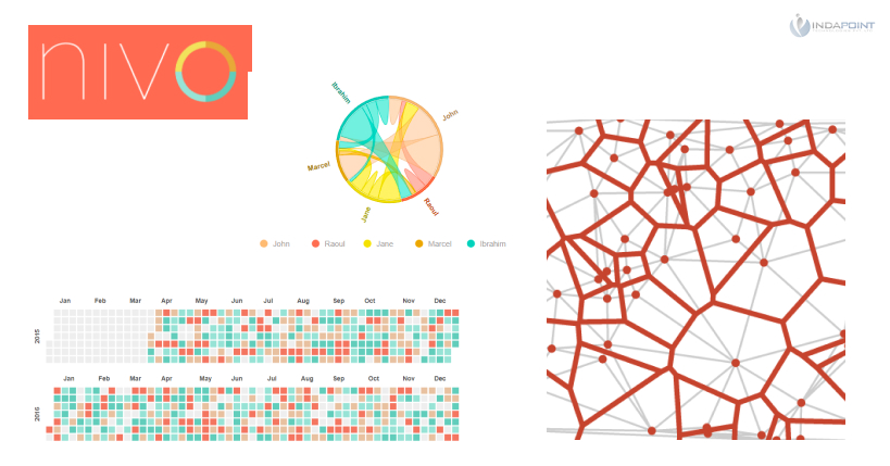
Nivo is a stunning framework developed on top of D3 and React that includes fourteen distinct sorts of components for presenting data. It was released in 2017, and on August 20, 2017, ProductHunt named it “product of the day.”
Nivo has several customization possibilities as well as three rendering methods: Canvas, SVG, and even API-based HTML. The documentation is excellent, and the demos are adaptable and entertaining. It’s a high-level library that’s easy to use, but it’s limited in terms of bespoke visuals.
Google Charts
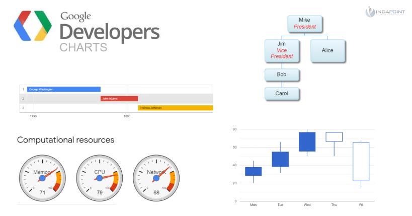
An incredibly popular charting Web service that I couldn’t leave off the list. It’s the go-to JS library for many people because it comes with a variety of pre-built chart kinds, including bar, line, area, calendar, geo charts, and many more.
amCharts
One of the most popular charting libraries available. Its elegant design distinguishes it from its competitors. Apple, Amazon, NASA, and a slew of other well-known companies are among amCharts’ clientele, which is fairly amazing.
AmCharts is a for-profit company, with prices starting at $180 for a single website licence. For a set fee, you get all of the charts you need, including geographical maps, as well as excellent customer service with response times of less than 3 hours on average. It appears to be a viable option for huge corporations.

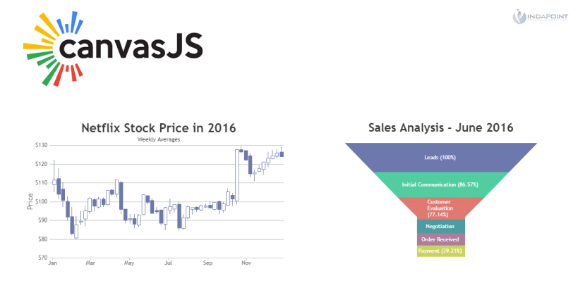
Canvas.js
Another commercial programme that creates attractive charts on a variety of devices and browsers. Some chart kinds, such as the network chart, sparkline chart, and gauge chart, are missing. It also has a steep learning curve.
On the other side, it’s lightning quick, even with 100k+ data points, and it comes with four pre-installed themes that should cover most eventualities. Apple, Bosch, Siemens, HP, Microsoft, and a long list of other companies are among its clients.
Highcharts
Highcharts is a data visualisation library that is entirely based on native browser technologies, eliminating the need for client-side plugins such as Flash. One of the primary benefits of using Highcharts is that it works well in all modern browsers, which include mobile devices and Internet Explorer starting with version 6.

Highcharts is compatible with any server that supports HTML. Because all of the renderings are done locally in a browser, we can even run Highcharts from a filesystem. It should be noted that standard browsers render graphics using SVG.
Highcharts is a package that can be installed using both npm and Bower. To use Highcharts, place the JavaScript files in the head> section of our website, as shown below.
<script src="https://code.highcharts.com/highcharts.js"></script>
When it relates to fundamental customizations, we can use a global theme. Themes are a collection of options that can be applied globally by calling the Highcharts.setOptions method. There’s also a responsive top-level configuration option, which involves a variety of functional chart types.
Highcarts also includes some performance metrics. We can, for example, use ES modules to create our own custom Highcharts package files. Custom files, for example, can improve browser load speed by having smaller file sizes and fewer files to request. Refer to the documentation for more information on other performance enhancements.
Unlike many charting libraries, such as Chart.js, Highcharts includes an accessibility module. Simply add the following file after any of the Highcharts JS files to include the accessibility module:
<script src="https://code.highcharts.com/modules/accessibility.js"></script>
Screen readers, internationalisation, and other accessibility features are also available. Aside from that, Highcharts includes an export module that allows users to download charts as PDF, PNG, JPG, or SVG. The chart data can even be exported to CSV, XLS, or HTML table formats using the export data module.
Highcharts has been built in a modular fashion since version 2, relying on extensions for additional functionality. Extensions allow us to create or add new features to the library’s capabilities.
ZoomCharts
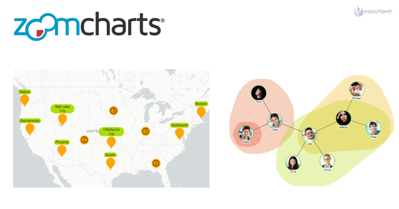
A commercial JS data visualisation tool that bills itself as the “world’s most interactive JavaScript charts library.” Apart from reactivity, it’s mostly concerned with multi-touch motions and a natural feel across a variety of devices.
The library promises stunning visuals that need little code and are simple to integrate into your product.
Zoomchatrts is a Canvas-based library that works up to twenty times quicker than SVG-based competitors utilising the same data and settings with default defaults.
Although I couldn’t locate a precise price for Zoomcharts, I did come across a couple of comments that described it as “expensive.” Whatever the cost, you’ll get incredible interaction, multi-touch gestures, and high-quality customer service in return.
Conclusion
It’s a tremendous responsibility to visualise data inside those programmes and convey it to end consumers. Companies base their strategy on the charts, data, and tables they’re given, and they frequently utilise them to decide whether or not to pursue commercial prospects. As a result, picking the correct tools can mean the difference between making it and breaking it in some circumstances.
In this article, we looked at the best JavaScript data visualisation frameworks in terms of features and efficiency. All of these can assist us in swiftly integrating beautiful and performant data visualisations into our application.
All of the libraries we’ve looked at thus far are fantastic, and the variations between them are minor: they all offer a wide range of supported functionality, a robust API interface, and excellent community support.


