Reasons Why You Should Adopt a Mobile-First Approach
December 15, 2022

If you look around, you’ll notice that nearly every second person is tapping, scrolling, and clicking on a smartphone. Over 3.5 billion people, or more than half the world’s population, had smartphones as of February 2020. And this figure isn’t going anywhere; you’ll watch it rising and leaping every day.
You can’t just reserve and see how the computerized world is changing as an entrepreneur. You need to move quickly to implement a mobile-first strategy if you want to continue being relevant to both your current and potential audiences. Mobile usage is only going to rise, and the only way to ride the waves of this mobile revolution is to adopt a mobile-first strategy.
Having mobility and adopting a mobile-first strategy will help you remain current while giving your users and visitors cutting-edge service. Additionally, you can be sure that your company would be accessible on smartphones almost everywhere if you let your company adopt a mobile-first strategy.
Overview
Luke Wroblewski’s book “Mobile First” is credited with popularising the phrase. In the book, Wroblewski lists the typical issues businesses encountered when switching from desktop to mobile web. Your business will be designed with mobile users in mind with a mobile-first strategy. A mobile-first strategy that is optimised puts your company’s mobile apps and mobile web capabilities ahead of desktop capabilities. “To be mobile-first, companies must focus on creating user experiences that are equally effective on mobile devices,” writes Daniel Newman, Principal Analyst and Founding Partner of Futurum Research. The first step is to design mobile user interfaces that convert; once we do that, the other devices will follow. Mobility, he added, “can help break down other silos within your business, putting an end to self-limiting technologies and behaviours that your digital transformation should eliminate.
Why this is such a smart idea the following: First using mobile
Great user experience
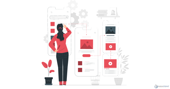
As the king of your website, your visitors should never have a negative online experience, so don’t make any compromises. Which would you prefer: giving them a fluid mobile-first experience or having your content pinch-zoomed?
Numerous businesses have created websites exclusively for mobile users, with the goal of providing an optimal user experience. If you want to have an advantage over them or at least be in competition with them, you must additionally dazzle your mobile visitors by providing them with a seamless mobile experience.
To make it easy to read and see, the design should be made in this way. A website should have simple navigation, an intuitive user interface, high-quality images that complement the text, and more.
Furthermore, to improve the user experience, the speed of loading on mobile-first web apps or websites can be enhanced by utilising a variety of techniques like Google AMP or other capabilities.
Google changed the default indexing to be mobile-first
Google, the industry leader in search engine technology, made one of the biggest announcements on July 1st, 2019: mobile-first indexing would take over as the standard method for ranking websites. In other words, the Google mobile bot would first crawl the website and then utilise mobile-friendly content analysis to index the web pages, structured data, snippets, and everything else. Mobile-first indexing is something that would alter the trajectory of any website, new or old.
Existing websites would be crawled based on their parity of content like text, photos, videos, etc., meta-data like titles, descriptions, meta tags, etc., and structured data whereas new websites or mobile applications will only be crawled based on their mobile design.
The web has evolved over time, moving from being primarily accessible on desktop computers to being mobile-first and responsive. If you want to remain relevant in today’s rapidly changing world, you must adapt and focus on mobile.
Increasing conversion rates
Any marketing strategy must focus on increasing conversions. You want your audiences to convert, not just become aware of your brand. Although desktops still have a higher average conversion rate than mobile devices, the difference is narrowing quickly. Since more people are using mobile devices to access the internet than desktop computers, the conversion rate of mobile devices will undoubtedly rise in the coming years.
The only thing you need to do is make sure that all of your website’s calls to action are located in thumb-friendly areas. To increase the likelihood of a conversion, you must place your CTAs in a thumb-friendly manner since 75% of users browse using their thumbs.
Scaling a mobile site easily
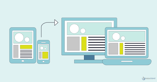
One benefit of starting with a mobile-first design is that scaling is incredibly simple when you start small. Any application can be scaled from mobile to desktop more easily than its alternative. The functionality of your desktop application would be compromised if you tried to scale it down for mobile.
In contrast, when you scale from mobile to desktop, you have complete freedom to add new functionalities without affecting the ones that are already there. To scale your product from a mobile-first design to desktop, all you need to do is add some interactive features and content.
To appear in SERPs
It should go without saying that you must adhere to Google’s mobile-first indexing policy if it uses it by default if you want to rank on the search engine’s result pages in addition to remaining relevant. Therefore, going the mobile-first method is essential if you want to rank on Google’s first page. Receiving the rating you deserve for your mobile site with the help of your SEO efforts won’t take much work.
Choose a mobile-first digital transformation strategy
Whether you’re launching a website, redesigning an existing one, or even aiming for digital transformation, mobile-first design is unquestionably the way to go. You shouldn’t only apply mobile-first principles to your website. Your entire course of commercial action should follow this strategy.
No matter what you do, you must design a user experience that is responsive to mobile users. And users of other devices would undoubtedly follow if you can draw in and convert mobile consumers to your digital goods. Your company can follow your clients wherever they go by adopting a mobile-first strategy.